


Comprehensive Design Guide for Custom Labels in Engineering and Product Design
Technical document preparation requirements, Color and font selection guidelines, Principles of ergonomic design, Techniques for adapting to different surfaces
StikTec
11/20/20255 min read

Technical Requirements for Custom Labels
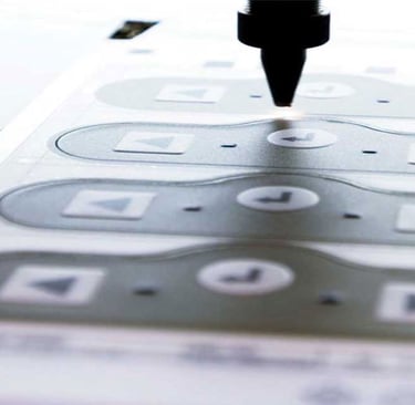
When creating custom labels for engineering and product design, it is crucial to adhere to specific technical specifications to ensure optimal results. One of the primary considerations is the choice of file formats suitable for industrial printing. Common formats include .AI (Adobe Illustrator), .EPS (Encapsulated PostScript), and .PDF (Portable Document Format). Each format has its own advantages, with .AI and .EPS being vector formats that allow for scalability without losing quality, while .PDF is highly versatile for both vector and raster graphics. Selecting the appropriate format is essential for maintaining print quality, particularly in complex designs with intricate details.
Color management is another critical element in the production of custom labels. Implementing the correct color profiles is vital to achieving color accuracy across various mediums. Professionals should utilize industry-standard color profiles, such as CMYK for print, to facilitate consistent color reproduction. It is advisable to conduct color tests before the final print run to ensure that the colors match the intended outcomes, as discrepancies can arise due to differing printing technologies.
Moreover, attention must be paid to minimum legible sizes for fonts and graphic elements. Readability is paramount; thus, ensuring that text and symbols maintain legibility under diverse conditions is essential. A general guideline suggests keeping text sizes above 6 points, while larger sizes may be necessary for prolonged visibility or when viewed from a distance. Safety margins also play a significant role in label design, generally recommending a margin of at least 1/8 inch around the label edges to prevent essential information from being cut off during the printing process.
Lastly, the functional layout of elements on labels is integral to communicating critical information effectively. Labels should be designed with a clear hierarchy, guiding the reader’s eye through the most important elements in an organized fashion. By combining these technical requirements, designers can produce custom labels that are not only visually appealing but also functional and compliant with industry standards.
Ergonomic and Icon Standardization Considerations
In the realm of industrial design, ergonomics plays a vital role in enhancing the safety and efficiency of user interactions with labels. The positioning of labels must be considered carefully, as their orientation can significantly influence readability. When labels are placed in locations that require awkward body positions to read, it can lead to user fatigue and possible errors in understanding critical information. Therefore, labels should be designed to be easily observable from various angles and distances, ensuring that essential instructions are communicated clearly, regardless of the user's position.
Readability is another critical consideration when designing custom labels. Factors such as font size, color contrast, and spacing can vastly improve or diminish the effectiveness of the information presented. Labels that are legible from a distance can prevent accidents and save time. For instance, utilizing larger text and contrasting colors enhances visibility, especially in industrial settings where lighting conditions may vary. Furthermore, using appropriate space around the text and icons helps prevent overcrowding, allowing important details to stand out.
Alongside ergonomic considerations, icon standardization is essential for promoting user comprehension. Icons that are universally recognized can significantly reduce the likelihood of operational errors, allowing users to quickly grasp the necessary information without language barriers. Consistent use of symbols helps in creating an intuitive interface that can boost productivity. Moreover, adapting labels to different surface materials can also impact visibility. Textures and colors of the surfaces can alter how light interacts with the label, and different materials may require varying printing techniques to maintain legibility and durability.
Several practical examples highlight the success of ergonomic label designs. For instance, labels on machinery that integrate highly visible icons and have utilized contrasting colors enhance the user’s ability to operate equipment safely. Features such as tactile feedback, through raised surfaces or distinct textures, can also provide additional cues for users. By adhering to ergonomic principles and standardizing icons, designers can create labels that not only communicate the necessary information but also contribute to a safer working environment.
Designing Labels for Challenging Conditions
When designing labels for environments that present challenges such as extreme temperatures, chemical exposure, and physical wear, careful material selection is crucial. The durability of a label is often contingent on the substrate and adhesive employed. For high-temperature applications, materials like polyimide or polyester can withstand heat while maintaining structural integrity, whereas polyethylene may be ideal for environments prone to moisture and chemical contact. Additionally, protective coatings such as laminates can enhance resistance against abrasion and solvents, ensuring long-lasting visual clarity.
Moreover, the choice of adhesive plays a pivotal role in label performance. Stronger adhesives like acrylic or rubber-based options often provide better bonds across various surfaces, including metals, plastics, and glass. It is essential to match the adhesive with the anticipated operational environment. For instance, in environments subject to extreme temperatures, a high-temperature adhesive can ensure the label adheres firmly, resisting peel and degradation.
For user interface labels on electronic devices and machinery, clarity is paramount. The aesthetic elements such as fonts and graphics must be optimized for visibility under different lighting conditions and at varying distances. Selecting sans-serif fonts can enhance legibility since they are easier to read in dynamic settings. Contrast between the label background and text color is also critical; high contrast can improve visibility, especially in dimly lit areas. Additionally, avoiding overly intricate designs can help maintain clarity when labels are exposed to dirt or scratches.
Real-world examples of labels adapted for challenging conditions can be found across various industries. For instance, labels used in automotive or aerospace applications often incorporate durable materials and finishes, ensuring they remain functional despite exposure to harsh elements. Labels in food processing environments employ strong adhesives and resistant materials, allowing for longevity while providing crucial safety information. By adhering to these practices, designers can ensure their labels thrive in demanding conditions.
Design Review Checklists and Common Pitfalls
The design review process is a critical stage in the development of custom labels within the engineering and product design sectors. To facilitate thorough evaluations, utilising structured checklists is recommended. These checklists should encompass essential elements such as material selection, durability requirements, environmental factors, and regulatory compliance. By adhering to a detailed checklist, engineers and designers can systematically ensure that all critical aspects are incorporated into the label design, thus mitigating the chances of oversight.
Common pitfalls often encountered in label design can adversely affect both functionality and aesthetic appeal. One frequent error is neglecting to test labels under real-world conditions. Without appropriate testing, labels may fail to withstand environmental stressors, leading to premature wear or illegibility. Additionally, designers sometimes make inappropriate color choices that affect readability or fail to align with branding guidelines. Color contrast is paramount; thus, it is essential to select hues that allow for clear visibility against the label's background.
Compliance with industry standards is another area that requires careful attention. Deviating from established guidelines can result in costly rework or, in some cases, regulatory penalties. Additionally, poor design choices can stem from a lack of understanding of materials' properties and their suitability for specific applications. Providing engineers with case studies of labeling failures can serve as an educational tool. For example, instances where labels eroded due to exposure to chemicals highlight the necessity of selecting appropriate materials and conducting meticulous testing.
By employing comprehensive design review checklists and being cognizant of common pitfalls, designers can greatly enhance the effectiveness and longevity of their label designs. Maintaining a rigorous review process is essential for ensuring that the final product meets both functional and aesthetic standards necessary for success in any engineering or product design initiative.
Contact
Get in touch for label solutions.
Online communication
WhatsApp: +86 130 2662 5634
📍Serving clients in France, Germany, UK & EU since 2020
Address
No. 69, West Shipai Avenue, Shipai Town, Dongguan City, Guangdong Province